Monday, May 30, 2011

A Potentially Bullish Memorial Week & June 1 Combination

One reader asked me this weekend whether the combination of Memorial week and the positive seasonality experienced on the 1st day of the month has provided any special results. I took a look, and it has. If the 1st trading day of the month is Tuesday then there was no edge apparent. But since 1977 any time you could actually buy the close of May 31st and sell the close of June 1st (meaning neither fell on a weekend or holiday), then June 1 would have been a winner. I have listed all 15 instances in the table below.


A couple of thoughts: 1) Between 1962 and 1976 the SPX was only 2-3 under the above conditions. 2) The Memorial week edge didn’t kick in until 1983 and the 1st of the month edge began in the late 80s. Therefore, the 5 instances between ’77 and ’84 may be due more to chance than to a seasonal influence. In any case, the combination has me giving Wednesday a bit more seasonal weight than I would if I considered either of these edges in isolation.

Friday, May 27, 2011

Memorial Week Seasonally Strong

Memorial week has some seasonal tendencies of which traders should be aware. I’ll be going in to some of these in this weekend’s subscriber letter, but below is a study that takes a broad look at the week as a whole. You’ll note that the study goes back to 1983. The reason it doesn’t go back further is that before 1983 the market did not exhibit a seasonally strong tendency during Memorial week.


Despite last year being down the circled stats are all impressive. An average gain of nearly 1.2% for the 4-day week along with a profit factor of 5 is very good. I’ll be discussing this and other Memorial week tendencies in this weekend’s letter. If you would like to view it you may sign up for a free trial here.

Thursday, May 26, 2011

Wednesday's Reversal Bar Suggesting An Upside Edge

On Wednesday SPY made a 20-day low before reversing to close higher. During long-term uptrends these kind of reversals have typically shown an upside edge. Below is a study from last night’s subscriber letter that demonstrates this.


These results appear strongly suggestive of an upside edge. Below is an equity curve using a 5-day exit so that you may see how the edge has played out over time.


The consistent returns make the equity curve appealing and provide me greater confidence in the results.

Tuesday, May 24, 2011

Market Could Bounce, But Tuesday Isn't Providing Its Usual Help

Tuesdays are renowned for short-term trend reversals. I discussed this in the 1/13/09 Blog and I’ve shown it a number of times since using different filters.

So Monday afternoon I took a look at 2-day drops above the 200ma on a Monday. Results were choppy and unremarkable. I then added one more filter in that the SPY had to close at a 5-day low. I was surprised by the results.

It appears that under these conditions, Tuesdays do NOT provide an upside edge. In fact, there appear to be bearish implications with the setup.

While I am seeing other evidence that the market may bounce here shortly, Tuesday seasonality does not seem to be providing the upside reversal edge it often does.

Friday, May 20, 2011

A Long-Term Look At POMO & the Stock Market

I’ve discussed my POMO stimulus indicator a number of times on the blog – most recently in the March 3, 2010 post. Below is a slightly different version of the indicator. Rather than look at volume it simply looks at “days”. Each POMO day in the last 20 that there was buying adds 1 to the indicator. Each day there was POMO selling subtracts 1. The reason I am showing a day count rather than the typical “volume amount” is that we are looking at a long-term chart. During 2005-2007 there was a good amount of POMO buying. But the levels of buying at that point were much lower than they are now. Therefore if I show “volume” instead of a simple day count, then the activity during that period would be almost imperceptible on the chart.  (Click on chart to enlarge.)

The green shaded areas are times where there was some pumping over the last 20-day period. The pinkish-red shading marks the period where the Fed was selling treasuries instead of buying them. The white areas marked the times where there was no POMO activity over the previous 20 days. POMO buying didn't always seem to take effect immediately, but periods without that buying were generally dismal. The 2 lengthy periods where the POMO indicators were at 0 or below lasted from 6/1/07 through 9/19/08 (SPX lost 18.3%) and from 4/22/10 through 8/17/10 (SPX lost 9.6%).


With QE2 ending soon, this raises the question, is the market capable of rising without the Fed liquidity pump? Or has it become completely dependent on it?

Tuesday, May 17, 2011

The Difference ADX Makes When Examining Reversals of Breakdowns

In the past I’ve discussed how breaks from consolidations are often much less reliable when looking for a reversal than if you hit a new high or low during a trending market. This is because the breakout will often create new excitement in the direction it occurs. Some of that is stops being blown and some of that is from breakout players looking to take advantage of a newly emerging trend.

One way to measure the strength of a trend is with the ADX indicator. It was pointed out to me today by a subscriber that the SPX 14-day ADX was dropping under 12 – which is an extremely low level. (The 14-period reading is the default reading for ADX with most charting packages.)

So using ADX as a measurement of trend strength I created a study that demonstrated low-ADX vs. high-ADX breakdowns, and how the implications were much different. First let’s look at situations like the present where the SPX breaks down and ADX is under 20.


As you can see, there is no substantial edge suggested when you are looking at a sharp move out of a consolidation with a low ADX.

Next I ran a 2nd test. This one used all the same parameters except I required the ADX to close above 20 instead of below it. This suggests the market has been moving instead of meandering. Those results are below.


What we see here are vastly more compelling results.
Unfortunately, with the ADX now just under 12, there does not appear to be a substantial upside edge offered by the break lower.

Friday, May 13, 2011

How the NYSE Closing TICK can be Utilized as a Valuable Indicator

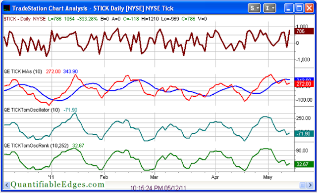
One market analyst whose work I’ve become familiar with and whom I have a great deal of respect for is Tom McClellan. Tom created an oscillator based on the closing TICK reading on the NYSE. The TICK simply measures the number of securites that last traded on an uptick versus. a downtick.  The closing value tells you how many finished the day on an uptick versus a downtick.  Tom told me he first got the idea to measure closing TICK values from Peter Eliades. The oscillator Tom created takes a 10-day moving average of the closing TICK, then a 10-day moving average of that value, and then subtracts the two. In November 2010 Tom published on his website a detailed overview and description of the indicator. Below is a link to Tom’s article.

http://www.mcoscillator.com/learning_center/weekly_chart/tick_not_just_a_bloodsucking_insect/

Tom has demonstrated that, like many overbought/oversold indicators, oversold readings will often lead to a bounce, and the market will often struggle after overbought readings.

I’ve done some work with Tom’s TICK Oscillator (which I have begun calling the TICK Tomoscillator.) As a visual indicator it is excellent on its own. But for conducting quantitative research I had some concerns with simply using raw readings. TICK ranges have evolved over time. They are affected by the number of securities traded on the NYSE (which constantly changes), and in 2007 they were impacted by the elimination of the uptick rule for shorting. Therefore I thought it might be worthwhile to use a relative reading rather than an absolute one. To do this I used a trick I learned from David Varadi of CSS Analytics and simply created a % Rank of the TICK Tomoscillator over a defined period.

The chart below is taken from the charts page in the subscriber section of the Quantifiable Edges site.  (Click here for a free 1-week trial.) On it you can see the closing TICK moving averages, the TICK Tomoscillator, and the 1 yr. % Rank of Tomoscillator. It isn’t at an extreme currently, but you can see where recent extremes took place. The April 18th dip in the Tomoscillator % Rank marked the market low, and it became extremely overbought at the end of April just before the early May market dip.


I’ve published a few studies in the Subscriber Letter that have shown very strong edges based on a combination of extreme readings and price action. But even on its own I have found substantial value in paying attention to the TICK Tomoscillator % Rank. Below are two equity curves from some research I published in the 4/19/11 Subscriber Letter. The first one looks at owning the SPX the day after the TICK TomOscillator 1-yr % Rank comes in under 20%. The 2nd one looks at TICK TomOscillator 1-yr % Ranks above 80%.


As is clearly demonstrated by the equity curves, closing TICK values, and the TICK Tomoscillator % Rank, are well worth monitoring.

Quantifiable Edges subscribers can see the TICK Tomoscillator readings every night on our charts page. The Tomoscillator indicators are also included in the Quantifiable Edges Tradestation Indicators & Functions package, which is free for all subscribers (or may be purchased by non-subscribers). The code package allows Tradestation users to place the Tomoscillator readings on their own charts and conduct their own research.

Wednesday, May 11, 2011

This SPX Pattern is Offering Some Compelling Bullish Evidence

Last night I decided to explore the pattern the SPX has carved out over the last several days. What I noted was that after making a new high it then pulled back for 4 days in a row. That 4 day drop has now been followed by a 3-day rally. At this point the SPX has not managed to overcome the recent highs. So I plugged those observations into a study and found some very compelling results.


While the number of instances was smaller than I would prefer the statistics appear to heavily favor the bull side.

Tuesday, May 10, 2011

A New Tool For Quantifiable Edges Subscribers

Quantifiable Edges subscribers were recently treated to a new feature available with their subscriptions.

Over time I have had numerous requests from members who wanted to utilize some of the Tradestation indicators and functions I’ve designed. Many of the indicators requested are shown on the Quantifiable Edges Charts page in the members section of the site. Others are discussed from time to time in the subscriber letter. I recently completed putting a few of these indicators together in a package. It is now available to the public (free of charge to all subscribers as long as their membership is active, or $125 for non-subscribers with no expiry on the code).

A list of calculation groupings is shown below:


1) Fast/Slow Offset Historical Volatility

2) Fed Days (today and tomorrow)

3) Breadth %

4) Breadth % Rank

5) Ratio Adjusted McClellan Oscillator (RAMO)

6) McClellan % Ranks

7) McClellan % Ranks (Pos/Neg)

8) Closing TICK TomOscillators


More detailed information on all of the calculations as well as instructions and examples can be found in the Quantifiable Edges Tradestation Analysis Techniques User Guide. The user guide may be downloaded by anyone who takes a free 1-week trial of Quantifiable Edges subscriber service (only name and email required).

Purchase includes Tradestation formatted .eld files for import as well as the 15-page guide. More indicators and functions will likely be added to the package over time. Purchasers may download updated versions free of charge for up to 1-year after purchase.

For a free Quantifiable Edges trial and to access the detailed user guide you may register here. The user guide can be found by clicking on the “QE Indicators/Functions for Tradestation” tab on the left hand side of the members’ pages.

Friday, May 6, 2011

Large Gaps Up On 1st Friday of the Month

The employment report nornally comes out on the 1st Friday of the month.  Today's report is helping to trigger a large gap up in the SPY.  I looked back at other times since 2003 where the SPY gapped up more than 1% on the first Friday of the month.


Results here are a little dissapointing in that they don't seem to suggest much of an edge in either direction.  Also a little surprising is that the employment report hasn't triggered more big gaps up.  In any case, I'll keep this test in mind in the future in case a more definite edge appears to emerge, but I'm not basing any trades on it right now.

Thursday, May 5, 2011

Unusual Action on the 3-day Pullback

A 3-day pullback on its own doesn't provide much of an upside edge. An edge tends to appear when the pullback happens in conjunction with other things. “Other things” might include a very low 3/10 Offset HV, a deceleration in the pullback, or a seasonal advantage. None of those things are appearing right now. But I did note one interesting aspect of this pullback that seemed worth further examination. While the SPX has declined the last three days, the VIX has risen the last three days. This isn't unusual. What is unusual is the fact that Wednesday's drop was the biggest for the SPX, yet the rise in the VIX was the smallest of the last 3 days.  I looked at other times this had occurred since 1990.


Not a whole lot of instances but early indications are that the setup may be bullish.  I examined the instances a bit further in last night's subscriber letter.  I tossed around whether to incorporate these results into my estimates.  Ultimately I decided not to.  The results were very variable, the number of instances was low, and the last time it occurred was 2003.  I did find it compelling enough to monitor going forward, though.

Monday, May 2, 2011

When Months Finish Strong

Bullish early-month seasonal tendencies have been well documented both here and elsewhere.  But what happens if we close the month at a high?  Does that sap some of the typical early-month strength?  Or is the market more likely to continue higher?  Below I show all instances since 1995 where the SPY finished a month with the highest closing price of that month.

The numbers are very compelling. Most of the upside edge occurs in week 1, but there is some follow through into week 2.