Friday, November 28, 2008

Volume Spyx Indicator Suggesting A Pullback

Earlier this week I introduced the Volume Spyx indicator. Testing has shown that risks often outweigh rewards during days following low Spyx readings. We’ve now had three days in a row of readings below 30. Below is a test which looks at similar streaks:


Over the next 7 days there appears to be a bearish bias. Not seen in the above table is that 75% of instances closed below the entry at some point in the next 3 days, 84% in 5 days and 94% within 9 days. A decent sized pullback tends to occur at some point in nearly all instances.

Wednesday, November 26, 2008

The Dangers Of Shorting Near A Potential Bottom

One thing traders need to keep in mind in the current environment is that when the market is bouncing off of intermediate-term lows it is more likely to get overbought and STAY overbought than when it’s simply consolidating in a downtrend. Shorting bounces off lows typically carries an extra level of risk because of this.

Let’s look at the how the market set up as of Tuesday’s close as an example. SPY closed higher 3 days in a row. Tuesday was the narrowest range in the last 5 days. When trading under the 200-day moving average, this combination can signal the market is likely to pull back. See the test below:


The propensity to pull back is most pronounced over the first 4 days.

Now let’s break down the above results a little differently. First let’s look at times the SPY set up as above but was NOT coming off a 50-day low:


Results here are decidedly more negative than in the original study. Two days out for example there are only 18% winners.

Now let’s look at the first setup again, but this time we only want to see those trades that were coming of a 50-day low:


There is no longer a bearish edge to the setup. In fact, there appears to be a bit of a bullish one. Now 2 days out there are 82% winners. (Although instances are low and that’s not really the point.) The point is that it is much more dangerous to short a market coming off of fresh lows. This is especially true when the lows occurred on extremely oversold conditions.

While previous attempted rallies did quickly roll over the last 2 months, that’s not always the case. Examples of oversold bounces off lows that would have been especially dangerous to short include August 2007, October 2002 and September 2001.

Tuesday, November 25, 2008

Introducing Volume Spyx

Over the Summer I developed a volume-based indicator that I decided to call Volume Spyx. I have been watching it closely ever since and have posted several studies to the subscriber letters associated with Volume Spyx. Essentially, it looks at an array of securities and compares their volume. Spyx readings are calculated for the NYSE (and compared to the S&P 500) and for the Nasdaq. I primarily use it on daily charts, but weekly have also tested well, and there even seems to be some edge using intraday bars. What I found is that in general, high Volume Spyx readings suggest a bullish bias and low Volume Spyx readings suggest underperformance or a bearish bias.

Below is a table taken from the S&P 500 Spyx Volume 1 document (Volume 2 should be out shortly). The document is 6 pages long and details market statistics related to Spyx levels. The document is available in the Quantifiable Edges Charts page. To access the charts pages you must be a subscriber, but trial memberships are available with just a name and email address. (Click here to sign up.) The table below looks at the period 1/1/1994 - 6/30/2008.


While volume Spyx can be used to help establish a trading bias on its own, Spyx tend to show larger edges when used in conjunction with price movement or other indicators. Below is a study from last night’s Subscriber Letter which demonstrates how I might use Volume Spyx in my analysis.

Low levels of Volume Spyx have typically led to market underperformance. This is especially true when they occur on an up day. There have only been 2 instances where the S&P 500 Volume Spyx has come in under 40 and the market has gained 5%. Therefore I loosened the parameters to a 3% gain.


Still the number of instances is low, but a low Volume Spyx combined with a price spike higher has been a bad combination. Below are the 7 instances and their 2-day returns:


I will be pointing out unusual Spyx activity and what it may suggest as instances arise. I’ve also decided that at least through the end of the year I will post the chart of the S&P 500 Volume Spyx on the Quantifiable Edges home page for all to see.

Monday, November 24, 2008

Thanksgiving Edge?

I’ve often heard about the positive tendencies of the market to rally Thanksgiving week. So I ran a quick test:


The above results actually go through the Monday following Thanksgiving. Positive tendencies may have existed in the distant past, but over the 21-year period I looked at there doesn’t appear to be any edge – bullish or bearish.

The market rallied hard on Friday after hitting historically extreme conditions. There are reasons to be optimistic about some follow-through this week. Thanksgiving doesn’t appear to be one of those reasons, though.

Friday, November 21, 2008

XXXtreme

So every few weeks a new selloff emerges that attempts to one-up the previous selloff. I showed some tables with incredible extreme conditions on 10/9 and 10/27. And now I present…contestant #3.


Also notable is that the CBI popped up to 13 today.

The top 3 breadth stats come from Worden Bros. TC2000.

P.S. Traders may want to take a look at the charts following the previous two extreme posts.

Wednesday, November 19, 2008

When Studies Collide

Monday’s breadth study suggested a bounce was likely. On Tuesday the bounce arrived. The S&P rose about 1%. But breadth was still miserable. The NYSE Up Issue % came in at 36%. Weak breadth on an up day is something I’ve gone over before. Three such studies from the blog came on June 10th, September 11th, and October 24th. While the bullish study from last night remains valid, these three are all in conflict with it.

Frequently I’ll see studies based on different indicators conflict with each other. It’s normal. One tool I use to help me sort through the studies is the Quantifiable Edges Aggregator. It helps to provide a quantified snapshot of all I’m seeing and aids me in setting my market bias.

Having studies based on one indicator conflict with each other is not normal. In this case it’s NYSE Up Issues %. It muddies my interpretation of the given indicator and dilutes its value. It’s very rare but in such cases I simply zero out the studies. When the edge is not clear, I step aside and wait until there is a clear edge.

-----------------------------------------------

Just a quick reminder to those in the Boston area that I'll be giving a presentation on short-term market edges tonight.

Tuesday, November 18, 2008

This Breadth Indicator Says We May Bounce Soon

One indicator I watch is the 10-period EMA of Up Issues / (Up Issues + Down Issues). When it gets extremely low it normally signals the market is oversold and likely to bounce. On Monday it crossed below 0.36. Below is a study showing how the market has performed other times the indicator has dropped this low.

Monday, November 17, 2008

A Past Study That's Struggling In The Current Environment

An astute reader of the blog pointed out a study from March that suggested a bullish bias when there was two 3.5% up days within a 10-day period. The bullish bias did play out in March as the market rallied over the ensuing weeks. Since then the setup has triggered on 9/19, 10/13, and 10/28 – all of which have been miserable failures. One issue when considering this study in the current environment is that 3.5% isn’t a substantial move.

As I discussed in Thursday’s blog, the average true range percent in the Dow over the last 30 trading days has been over 6%. That’s not to say that Thursday’s reversal bar isn’t a positive one. Things to look for generally include a strong move higher, strong volume, and strong breadth. Thursday qualified in all areas. Against the current backdrop I've been looking for a bit more confirmation. Tests have been mixed.

Friday, November 14, 2008

5% Up Days

I recently looked at one-day selloffs of over 5% and found them to have an upside edge. Tonight I looked at rallies of 5% or greater. For the S&P the sample size is small but there has been a bit of a downside bias since 1960:


Of the 11 instances, the only one that didn’t close below the close of the 5% day within the next 4 days was the 5/27/70 occurrence.

Listed below is the one-day performance following all 5% up days for the S&P 500.


A couple of things to note: First, 8 of the last 9 have closed lower. Second, the lower closes have generally been tame – both in relation to the 5% up day and compared to the instances that continued to rise the next day.

Thursday, November 13, 2008

The Most Volatile Market Environment...Ever?

In my last post I looked at the increased volatility based on the size of the average overnight gap in SPY. Today I’ll examine the current market’s volatility based on its Average True Range Percent.

In the chart below I show the Dow Jones Industrial Average from 1986 – present. The yellow line represents the 30-day average true range on a percentage basis. The average true range over the last 30 days closed at an astonishing 6.02% on Wednesday.


It appears the only time since 1986 where it has come close the current 6% level was during the Crash of ’87 period when it poked just above 6. In actuality, though, the comparison isn’t quite fair due to the way the range was calculated previous to 1992. From Investopedia:

Theoretical Dow Jones Index
A method of calculating a Dow Jones index (most often the DJIA) that assumes all index components hit their high or low at the same time during the day.

In other words, the "theoretical Dow" uses the daily highs for all 30 Dow components to calculate the index high, and the lows to calculate the index low. In January of 1992,
Dow Jones started using the "actual" method, which calculates the index at 10-second intervals throughout the day. Before this point, the theoretical calculation was the only way to compute the high and low of the index. This method assumes that all stocks hit their high or low at the same time. Because this rarely happens, the theoretical high will almost always be higher than the actual, and the theoretical low will almost always be lower than the actual.


Taking the pre – ’92 exaggerated range into account, it appears almost certain that the recent market has displayed a higher Average True Range % than 1987. Going back further in history, the only other period where ranges approached these levels were…the 1930’s.


Even during this period the only time where the average true range percent got much above 6% was following the Crash of ’29 when it hit nearly 7%. Since the ranges were exaggerated due to use of the Theoretical Dow calculation, it’s possible that the current environment may actually be the most volatile.

You may notice from the charts that the spikes in volatility tend to occur near market bottoms. An ATR spike can alert you that a bottom may be coming. Like many indicators that use moving averages, though, the 30-day ATR% is a lagging indicator. It typically peaks after the bottom has been made. Look for this measure to turn down again once a bottom (at least a temporary bottom) is in place.

Tuesday, November 11, 2008

A Long Term View Of Average Gap Sizes

Another 2% gap today. For those that feel 2% gaps are becoming the norm – they are. Below is a chart that shows the 50-day absolute average gap of the SPY. Over the last 50 days prior to this morning the average gap had been 1.87% (in either direction). This is nearly twice as large as any other time since the SPY began trading in 1993. First, the chart. Then a few remarks.


1) Notice how prior peaks in the size of the average gap have coincided with bottoms in the market.
2) The fact that we are nearly twice the level of any prior history once again speaks to the unique and extreme nature of the current environment. This can’t be stressed enough.
3) Prior studies I published on gaps that used static assumptions for gap sizes may need to be reworked for the conclusions to be meaningful in the current environment.

Monday, November 10, 2008

Blogroll Additions

Some long overdue additions to the blogroll were done today:

Market Rewind – Jeff Pietsch does an excellent job of posting running market commentary, links, and trading thoughts. I especially enjoyed his “Studies, Systems, & Methods Vault” which was posted on Saturday.

Blog For Trading Success – Ray Barros is a trading instructor and his blog is full of tips and trading techniques as well as market analysis.

Condor Options – Plenty of insightful information on options strategies.

Masteroftheuniverse’s Weblog – A combination of trading commentary and anecdotes. Good news for those who enjoy his writing - it looks like he has a book coming out, too.

More to come...but not today.

Friday Was Another Low Volume Rally

The market rallied nicely on Friday but volume came in quite a bit below the previous few days. Strong up days on low volume have been creamed lately. A few recent examples would include 9/30, 10/13, 10/20, and 11/4. The table below shows results following all one-day gains of 2.5% or more that were accompanied by volume under the 10-day average.


Much more on this study was published in last night's Subscriber Letter. If you haven't yet trialed it then simply email QuantEdges@HannaCapital.com with your name and email address an I'll send you last night's Letter along with 3 upcoming ones.

Friday, November 7, 2008

Down Another 5% - History Being Made Again

Yesterday I looked at how the S&P has responded following drops of 5% or more. Most often is has led to a bounce. Thursday failed – and in a big way as instead of bouncing it fell another 5%. The only time going back to 1960 that the S&P has fallen 5% for 2 days in a row was during the Crash of 87.

Since my Dow history file goes back to 1920 I decided to look at that. There have been 4 times that the Dow dropped 5% or more 2 days in a row. They were all between 1929 and 1933.

Of course the Dow didn’t drop 5% on Thursday. It did drop over 4%. So I loosened the parameters to 4%. Results below:


There appears to be a bullish edge over the 1st two days. After that it dissipates. One of the instances included above was the Crash of 1987. The rest of them all took place between 1929 and 1940.

I can’t even count how many tests I’ve run over the last month whose results came up “1987” or “between 1929 and 1940”.

Thursday, November 6, 2008

I'll Be Speaking In Boston On November 19th

For those readers who happen to be in the Boston area I thought I’d let you know that I will be giving a presentation at the next Boston Investors’ Business Daily Meetup Group meeting on Wednesday, November 19th. I’ll be discussing short-term market behavior and edges.

The meeting will take place at MIT. It is free and open to the public, although the organizers request that you RSVP. More information may be found using the link below:

http://www.meetup.com/BostonIBD/calendar/9059814/

I hope to get to meet some of you there.

5% Drops Often Followed By Rebounds

I looked back at all prior 5% drops in the S&P 500 since 1960. From 1960 until 1987 there weren’t any. Since 1987 there have now been 14 of them. The November 5, 2008 drop was the 6th 5% drop since early September. Generally these large drops have been followed by a bounce at some point over the next few days. I show all instances since 1960 in the table below:


Of the 13 instances, 10 closed higher the following day. If you give the trade 4 days to work then 12 of 13 closed higher than the entry at some point. The lone loser was October 16, 1987. That date is notable because it was the Friday prior to Black Monday.

Wednesday, November 5, 2008

VXO Suggesting A Pullback Is Likely

I’ve discussed in the past that it is a common misconception that a low VXO is a bearish indicator. When the VXO becomes extremely stretched, as it is now, then that changes.


Instances are a little low, but both winning percentages and Win/Loss Ratio are very suggestive of short-term bearish implications. Also of note is that 18 of 20 instances (90%) closed lower at some point in the next 3 days. There was only one instance that failed to close lower than the entry at some point in the next 7 days. That instance was 10/19/98 which essentially traded sideways for 7 days before beginning a new leg up.

Tuesday, November 4, 2008

Election Edges?

Today I give you some political stats:

First I wanted to see if there was general excitement about the new guy. In other words, there is not an incumbent victory…


Nothing terribly exciting here. Pretty much 50/50 over the next week.

Next I broke it down by party and ran the stats out a bit further.

Since 1920 this is how the Dow has performed after a Republican has won the white house. (I excluded 2000 since no one knew if a Republican or Democrat won for a long time after the election.)


Still not much better than 50/50 until you get out a couple of months.

Now lets see what has transpired after a Democrat wins:


A big Day 1 is apparent here, which could bode well for Wednesday if Obama wins. Beyond that – not much noteworthy. You’ll note that 40 days out the Democrat and Republican return is about the same.

No huge edges here. I’m likely done with this study for at least 4 years.

Monday, November 3, 2008

Tests Of Strength

A few weeks ago I wrote about the propensity of upside gaps of 2% or more to pull back at some point in the following few days. There are currently 2 upside gaps of 2% or more that have yet to close below the opening gap price. They are the 10/28 and the 10/30 gaps. It appears unlikely that the 10/28 level of $87.34 will be threatened in the next day or so. Should the 10/30 opening gap also hold that could be viewed as a significant sign of strength for this early attempt at a rally.

Another possible sign of strength will also be challenged in the next few days. In my August 28th post I showed a system that took advantage of the choppy, downward trading that had existed over the last year plus up to that point. Below are updated statistics of this simple system:

Sell short if the S&P 500 closes higher 2 days in a row. Cover on close below entry price – up to 4 days later. If still not profitable on day 4, close anyway. $100k/trade. June 1, 2007 – present.


Amazingly, the system has not triggered since 9/26/08. Therefore, the 48% profits generated were all achieved prior to the big October selloff. The system is also in an 18-trade winning streak, dating back to April.

The market is reaching short-term overbought conditions that over the last year and a half have led to at least short-term pullbacks. Whether it is able to rally in the face of such conditions or whether it pulls back sharply in the next few days could be a telling sign of strength or weakness, and whether a character change could be in order.

Sunday, November 2, 2008

Subscriber Letter Scorecard for October

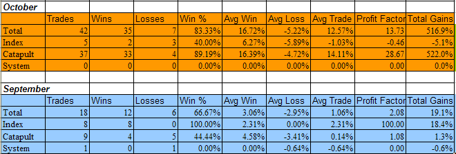
October may have been the worst month in a long time for the stock market, but it was the best month ever for the Subscriber Letter. The primary strategy responsible for the oversized trading profits were the Catapult trades, which combined comprise the CBI. They also performed well during the January and March selloffs, but suffered an unusually difficult period during the June/July selloff.

Before revealing the results, some important notes:

I don’t suggest position sizes. The primary reason for this is I’m not acting as a financial advisor. I don’t feel it is appropriate to suggest allocation sizes without understanding someone’s financial situation and risk tolerance. Even for my own trading I run different portfolios with different levels of aggressiveness. For instance, my most aggressive portfolio is my IRA. Here I may use options to sometimes get 400-500% leveraged. Other portfolios on the other hand normally take much more conservative stances and some rarely reach or exceed 100% exposure.

Since I don’t suggest position sizes this is should not be considered a performance report, but rather a trade idea scorecard. Therefore, no matter how objective I try to be the reporting of the results is always going to be skewed depending on how you approach the trades. For instance, I always recommend scaling into the Catapult positions in 3 parts, whereas the “System” trades (whatever system I unveil other than Catapult) are normally one entry. The “QE Index” trades I normally recommend scaling into as well. For my own trading I trade much larger size with the index trades than any of the individuals. I also control my exposure by limiting the total amount invested per day. As I mentioned, this will vary depending on the account I’m trading. My most aggressive account I may put in up to 100%/day and get heavily leveraged using options. A more conservative account may max out at 15%-20% per day.

It’s unlikely anyone would have taken all of the trades with equal amounts, so personal results would vary greatly depending on the trader’s approach. Still, there was more than ample opportunity to take advantage of the Quantifiable Edges trade ideas in October. With all those caveats in mind, recent results are listed below and broken down by category. Since October was so unusual, I’ve also shown the September results below.


If you’d like a free 3-day trial of the Quantifiable Edges Subscriber Letter, just shoot an email to QuantEdges@HannaCapital.com and include your name and email address.