Saturday, May 31, 2008

Subscriber Letter Results For May

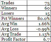
Below are the summary results for the trade ideas that were closed during the month of May. Results in May were above average in most areas.


A few notes:

The above results do not include currently open trade ideas.

All trade ideas come with specific entry and exit criteria and are tracked daily.

All trade ideas are in highly liquid stocks and ETF’s. The Quantifiable Edges Subscriber Letter does not deal with small caps.

All trade ideas are quantified through testing prior to entry. Subscribers may use the backtest results to help judge whether the idea may be appropriate for them.

This is not a performance report. I don’t know subscriber’s financial situations and risk tolerances. Therefore I do not suggest trade sizes.

There are essentially 3 kinds of trade ideas: 1) CBI trades, 2) System trades, and 3) Index trades.

For those that may be interested in the Index trades, they mostly use the S&P 500. All S&P index trades are entered using SPY. I don’t use leveraged etf’s like SDS or SSO to juice the performance numbers. Many times I will suggest scaling in to these trades in either 3 or 4 parts. Below are all SPY trade ideas that received fills since the 2/19/2008 inception:


If you’d like to either take advantage of Quantifiable Edges market timing, track the individual trades that construct CBI, or learn new systems (like this one) whose code is available for subscribers to download into Tradestation, you may want to give the Quantifiable Edges Subscriber Letter a look. For a free 3-day trial simply send an email with your name and email address to QuantEdges@HannaCapital.com For further information or to subscribe, click here.

Friday, May 30, 2008

A Volume Pattern That Makes A Huge Difference

On Thursday the market finished higher for the third day in a row. In my “Count To Three” post back in February I showed how 3 higher closes when the market is trading below its 200-day moving average has a negative expectation over the next week or so.

Below are some more detailed statistics of how the market has responded to this pattern:

So the move we’ve seen over the last 3 days creates a negative expectancy in the near future, right? Not so fast. Notice how NYSE volume rose over the prior day on both Wednesday and Thursday. Higher volume on up days is supposedly a good thing. So let’s break it down further.

In this next table I show all instances when our volume pattern of rising two days in a row didn’t occur:


In this case things look even worse.

So now let’s look at those times when the supposedly positive volume pattern of the last two days played out:


Quite a striking difference. The increasing volume changed the expectation of the price pattern from strongly negative to solidly positive. This is an example of why traders should not simply look at price in a vacuum.

Those who would like to see more research on how the market reacts following rising or falling periods may want to check out Dr. Steenbarger's recent interesting post on the subject.

Also, for those that may not have noticed, the CBI dropped back to "3" today. This puts is back in what I consider to be a neutral state. The "5" reading I discussed a couple of days ago turned out to be a winning signal - perhaps a good sign for the market that pullbacks may be less severe than they were in late 2007 - March 2008. We'll see.

Thursday, May 29, 2008

Do The Banks Need To Lead The Next Rally?

There is a school of thought that says the banks and financials got the stock market into this mess and they will likely need to lead the market out of it. The sectors that get beat up the most on the way down do tend to bounce the best off the bottom, and it would seem difficult for the market to kick off a strong bull phase without at least some participation from the banks. Expecting them to lead may be a bit much, though. Let’s take a historical look at the BKX vs. the SOX from a relative strength standpoint. I use the SOX here because of its reputation to lead.

The current ratio of the BKX to the SOX is about 0.18. On January 1st 1995 it was also about 0.18. It has traveled quite a bit to get nowhere. In early July of ’98 the ratio hit a high of close to 0.36 and in March of ’00 it hit a low of about 0.05.

In the chart below I show the S&P 500, the BKX and the SOX. At the bottom of the chart is an intermediate-term relative strength measure. It looks at the current ratio as opposed to the 20-week moving average. When the red line is above the blue, that means the BKX is outperforming the SOX. When the red line is below the blue, that means the SOX is outperforming the BKX.


Since the beginning of January 1995 the S&P 500 has gained about 924 points. (I did these calculations mid-day on Wednesday.) When the SOX has outperformed the BKX the S&P has gained 1264 points. When the BKX has outperformed the SOX, the S&P 500 has lost 340 points. The BKX has spent roughly 6 years and 2 months leading and 7 years and 3 months lagging.

What if we compare the BKX to the S&P 500? This may provide a better picture of leader/laggard without worrying about the SOX. The BKX/SPX ratio is about 0.054 now. In January 1995 it was 0.056. In this case the S&P has gained about 979 points when the BKX was a laggard, and lost 55 points when the BKX was a leader. Not quite as severe, but the point remains the same – historically the BKX has not been a leader of strong rallies. The market may have trouble rallying strongly without faith in the banks, but that doesn’t mean these classic laggards will all of a sudden become powerful leaders.

Wednesday, May 28, 2008

The CBI Wakes Up

The CBI has begun to wake up this past week. For those new to the blog CBI stands for Capitulative Breadth Indicator. An introduction to it is here. A list of posts here. Completely dormant since dropping to “0” on March 24th, it has perked up in the last week and reached “5” today. “5” is the first level where I normally begin to pay attention. First I’ll show some raw numbers and then I’ll offer a few thoughts.
Generally the higher the CBI the higher the percentage of qualifying large-cap stocks that are undergoing extreme selling and likely to bounce. When you get a broad group of stocks primed to bounce, it usually hints at a market that is likely to bounce as well. A CBI trade normally consists of entering an index position when the CBI hits a certain threshold (5, 7, and 10 are the ones I typically look at) and exiting when it returns to a neutral state, normally defined as a reading of 3 or lower.

Below is a performance report showing what would have occurred had you bought the S&P 500 whenever the CBI hit 5 and then sold when it returned to 3 or lower. It goes from January 1995 to present and does not include dividends, commissions, or slippage. All trades were executed at the 4pm close and assume $100,000 per trade.


As you can see, even a CBI of 5 can provide the tools for a pretty robust system. I don’t typically use a 5 as a reason to go long, though. I do use it as a reason to avoid entering new short positions and tightening stops on old ones. I prefer to save most of my ammo for more significant cluster sizes like 7 or 10 depending on my overall market outlook.

Recent action for a 5 reading has been sub-par. Four of the last five occurrences, dating back to July 2007, have been losers. Prior to that, from April of 2005 through June of 2007, there were 11 trades – 10 of which were winners. A possible reason for this is that the recent period has seen much more severe selloffs. The mid-2005 through mid-2007 period saw mostly shallow pullbacks.

My current market analysis suggests patience. I’d rather wait for a higher reading before becoming too aggressive. On the other hand, the moves up can be quick and powerful so I wouldn’t want to be caught short right now either. This particular indicator does indicate a short-term upside edge.

Tuesday, May 27, 2008

Significance

One term that sometimes gets mentioned here by me and others via the comments section is “significance”. It is a statistical term that most readers are likely familiar with but many perhaps do not fully understand. Rather than try and explain it myself, below I have pasted an excerpt from the late Arthur Merrill’s August 1986 newsletter. It was passed along to me from a colleague a while back. I found it to be clear, concise, and a much better explanation than I could possibly write:

If, in the past, the records show that the market behavior exhibited more rises than declines at a certain time, could it have been by chance? Yes. If a medication produced cures more often than average, could it have been luck? Yes.

If so, how meaningful is the record?

To be helpful, statisticians set up “confidence levels.” If the result could have occurred by chance once in twenty repetitions of the record, you can have 95% confidence that the result isn’t just luck. This level has been called “probably significant.”

If the result could be expected by chance once in a hundred repetitions, you can have 99% confidence; this level has been called “significant.”

If the expectation is once in a thousand repetitions, you can have 99.9% confidence that the result wasn’t a lucky record. This level has been called “highly significant.”

If your statistics are a simple two way (yes-no; rises vs declines; heads-tails; right-wrong), you can easily determine the confidence level with a simple statistical test. It may be simple but it has a formidable name: Chi Squared with Yates Correction, one degree of freedom!

Here is the formula:

Χ2 = (D - 0.5)2 / E1 + (D - 0.5)2 / E2

Where D = O1 - E1 (If this is negative, reverse the sign; D must always be positive)
O1 = number of one outcome in the test
E1 = expectation of this outcome
O2 = number of the other outcome
E2 = expectation of this outcome
Χ2 = Chi squared
If above 10.83, confidence level is 99.9%
If above 6.64, confidence level is 99%
If above 3.84, confidence level is 95%

An example may clear up any questions:


R = number of times the day was a rising day in the period 1952 - 1983
D = number of times it was a declining day
T = total days
% = percent
ER = Expected rising days
ED = Expected declining days

Overall, there were more rising days than declining days, so that the expectation isn’t even money. Rising days were 52.1% of the total, so the expectation for rising days in each day of the week is 52.1% of the total for each day. Similarly, ED = 47.9% of T.

For an example of the calculation of Χ2, using the data for Monday:

O1 = 669
E1 = 799
O2 = 865
E2 = 735
D = 669 - 799 = -130 (reverse the sign to make D positive)

Χ2 = (130 - 0.5)2 / 799 + (130 - 0.5)2 / 735
= 43.8, a highly significant figure; confidence level is above 99.9%

If expectation seems to be even money in your test, such as right/wrong), the formula is simplified:

Χ2 = (C - 1)2 / (O1 + O2)

Where: Χ2 = Chi squared
C = O1 - O2 (If this is negative, reverse the sign, since C must always be positive)
O1 = number of one outcome in the test
O2 = number of the other outcome.

[Chi squared is not always the correct statistical tool. When the number of observations is less than 30, Art used a test based upon the T-table statistic:]

The problem: In a situation with two solutions, with an expected 50/50 outcome (heads and tails, red and black in roulette, stock market rises and declines, etc.) are the results of a test significantly different from 50/50?

Call the frequency of one of the outcomes (a), the frequency of the other (b). Use (a) for the smaller of the two and (b) for the larger. Look for (a) in the left hand column of the table below. If (b) exceeds the corresponding number in the 5% column, the difference from 50/50 is “probably significant”; the odds of it happening by chance are one in twenty. If (b) exceeds the number in the 1% column, the difference can be considered “significant”; the odds are one in a hundred. If (b) exceeds the numbers in the 0.2% (one in five hundred) or 0.1% (one in a thousand), the difference is “highly significant.” Note that the actual number must be used for (a) and (b), not the percentages.

Example: In the last 88 years, on the trading day before the July Fourth holiday, the stock market went up 67 times and declined 21 times. Is this significant? On the day following the holiday, the market went up 52 times and declined 36 times. Significant?

For the day before the holiday, (a) = 21 and (b) = 67. Find 21 in the left hand column of the table; note that 67 far exceeds the benchmark numbers 37, 43, 48, and 50. This means that there is a significantly bullish bias in the market on the day before the July Fourth holiday.

For the day following the holiday, (a) = 36 and (b) = 52. Find 36 in the table. The minimum requirement for (b) is 56; 52 falls short, so that no significant bias is indicated.

Table for Significance of Deviation from a 50/50 Proportion: (a) + (b) = (n)

This is essentially the T-table statistic. It should be used instead of Chi Squared when the number of observations is less than 30.


Source: Some of the figures were developed from a 50% probability table by Russell Langley (in Practical Statistics Simply Explained, Dover 1971), for which he used binomial tables. Some of the figures were calculated using a formula for Chi Squared with the Yates correction.
In the next few days I'll offer some opinion on the importance and use of significance testing.

Thursday, May 22, 2008

WR7 NR7 is back

On April 15th I showed what happens when a wide range selloff is followed by a narrow range day. (Hint: it appears to be bullish for the Nasdaq 100.) You can re-read that post here.

For those with Tradestation who would like to download and play with that study tonight, I have just reduced the price from $12.00 to $2.00. It comes with an .eld to import and a pre-set workspace. All open code. Click here to go to the studies page.

In my recent post on system discussion the other day I neglected to mention the new work BZBtrader is doing. If you haven't visited his blog in a while, it's changed a bit in the last couple of weeks as he is now starting to focus on system trades as well as his normal QQQQ stuff.

Nasdaq Net New Highs Potentially Ominous

With my beloved Celtics on late tonight I likely won’t have time to post. So here’s a little mid-day study for you.

Since early April the Nasdaq has been a leading index. Net new highs have failed to expand, though. According to my data provider, they peaked at 64 on May 2nd. The last few days there have been significantly more new lows than new highs. If you take the net difference and divide it by the number of stocks trading on the Nasdaq your result for Tuesday and Wednesday was less than -1%. (Wednesday: 53 new highs – 93 new lows = -40 net / 3030 issues = -1.32%). Coming off a 4-month (80 day) high this is an unusual occurrence.

I looked back to 1994 (as far back as I had the data) to see if I could find other times where the Net New High Percentage ratio closed below -1% twice within 3 days of an 80-day high. I found three other dates 7/23/98, 7/20/07, and 11/02/07. Charts below (click to enlarge):


Pretty ugly.

If I allow for two -1% Net New High Pct days within a week (rather than 3 days) of the top then 10/15/99 also shows up.

The bulls better hope this time is like 1999.

Sharp Selloff A Buying Opportunity?

The market has taken a beating the last two days. This has served to relieve some of the stretched conditions I noted late last week. Most notably the CBOE put/call ratio and the VIX. (Note that the VIX system I shared Thursday afternoon triggered an exit today – good for a 2.43% gain in 3 days.) So now what? Is this a buying opportunity? Two days ago the market was hitting 4 month highs. The S&P 500 today closed about 3.5% below those highs. Let’s take a look at what has happened in the past when these kinds of sharp selloffs occur near a high:

The SPY rose 6 days in a row as of Monday. All six days have been wiped out in the last two. Looking at the 51 other such occurrences where the market has gone from a 50-day closing high to a 8-day closing low in two days, the positive expectancy going forward peaked after 5 days. A couple of weeks later, expectancy was nearly back to flat.

Here we look at a percent drop rather than an 8-day low:


Again a brief bounce that quickly peters out. I then combined the two. Only 12 occurrences but results seem notable. In this case the bounce only lasted 3 days and the expectancy beyond that turned quickly negative and stayed negative.


I ran some other tests tonight as well. So far I am not seeing anything that would lead me to believe there is a strong chance that the selloff has completely run its course.

Tuesday, May 20, 2008

System Discussion From Other Blogs

I've noticed some good posts on systems lately. Below are a few for your review:

Using RSI(2) to time ETF entries – Woodshedder shows some results and discusses a current trade.

IBD Index seems to out-do himself every weekend with a new post on system design. This week he discusses profit targets. One of the few authors I’ve seen to thoroughly test breakout systems. This is a regular part of my weekend reading.

Afraid to Trade with some thoughts on backtesting.

Skill Analytics - A brand new blog dedicated to discussing system based trading strategies. I'll be keeping an eye on this one as it looks to have potential.

Failure To Launch

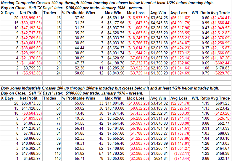
About 2 ½ weeks ago the Nasdaq 100 blasted through it 200-day moving average. Tests I ran at that time suggested an edge over the 1-4 weeks following such activity. So far so good for the NDX. Today the S&P 500 tried to smash through the 200-day moving average. After a strong morning it turned tail and dropped fairly hard in the afternoon. In doing so it failed to close above the 200. Tonight I looked at possible implications of intraday spikes above the 200ma that fail.

This first test looks quite negative for the 1st week and then positive over the following three weeks. Note the Max Loss column, though. This one triggered the night before the Crash of ’87. This is the biggest possible outlier you could have over the time period tested. To see results more representative of typical, I excluded that trade.


It is always important to look at outliers. A massive outlier like the crash of ’87 could dramatically change the results. Now the results don’t look so bad initially. There is still some downward chop in the first week, though, followed by a nice rise in prices.

To better asses the possible influence of the criteria on performance I then looked at how the Dow and Nasdaq performed under similar circumstances.


The Nasdaq never got it together following the “Failure to Launch” through the 200. The Dow results were choppy and uneven. Four weeks out they were positive but less so than a random sample over the test period.

The way I see it, a failure of the 200 like we saw today appears to lead to weakness in the short-term. The one consistent of the tests is that they all showed a negative expectancy shortly after the event. Longer-term whether the market gets it together like the S&P results suggest or continues to struggle as the Nasdaq results suggest is unclear. Keep in mind that beyond the short-term there are much bigger forces at work than today’s action. I therefore wouldn’t try and extrapolate out too far with this test.

The short-term negative does jive with some of my other work and I continue to believe a pullback is likely in the next few days.

Monday, May 19, 2008

High Five


Friday the market made its 5th higher high in a row. Below is a table showing how the market reacts to at least 5 higher highs and a 50-day high:

This study suggests limited upside and a good chance of sideways chop over the next 1-20 days.

The VIX system oulined in Thursday's blog would have triggered a short index entry Friday at the close.

I'm having a hard time finding anything suggesting prices are likely to continue higher.

Friday, May 16, 2008

A Few Sentiment Observations

A few quick notes today on Thursday's market action:

I sliced Thursday’s price and volume action a number of different ways last night. Factors I looked at included new intermediate-term highs being hit, a 1% move up, and relatively low volume. The results of all my tests indicated choppy action over the next week.

The VIX spike down more than 10% below its 10-day moving average. Check out my post from yesterday which discusses in detail the implications of this. Basically, this on its own is not a signal to short, but when the oversold condition of the VIX begins to work off, it may be.

The VIX:VXV ratio that Bill Luby tracks hit it’s lowest level to date on Thursday. Breaking the previous low set on 12/21/07. Also The CBOE total put/call ratio hit its lowest level since 12/21. December 21st was not a good time to be going long.

Dr. Brett Steenbarger tracks the 10-day moving average over the 200-day moving average of the CBOE total put/call ratio. That reading dropped below 0.85 for the first time since early October – also not a good time to be long.

Thursday, May 15, 2008

Is A Low VIX A Short Trigger?

The declining VIX has been a hot topic lately. Adam at the Daily Options Report had an interesting and (as you’ll see below) accurate comment the other day about overbought/oversold VIX readings: “Also, oversold VIX does not provide as good an indicator as overbought. Outright fear tends to lead to big turns, outright disinterest can just linger.”

The most common technique I see discussed for trading based on the VIX is viewing it in relation to its 10-day moving average. This was originally made popular by Larry Connors. Many traders will throw moving average envelopes around the VIX, wait for a stretch and then trade the S&P 500 based on a mean reversion. A relatively high VIX means market participants are fearful and the market should be bought while a relatively low VIX is a sign of complacency and a short signal. With the VIX continually dropping, traders have been on alert for a VIX stretched below its 10-ma to try and short. But is that really a good time to be short?

Over the last 10 years, owning the S&P 500 when the VIX was more than 10% below its 10-day moving average was significantly more profitable on average than owning it when it wasn’t. Let me repeat that. Owning the S&P 500 when the VIX was more than 10% below its 10-day moving average was significantly more profitable on average than owning it when it wasn’t. To illustrate I ran a study:

Short the VIX on a cross of the lower 10% envelope of the 10-day moving average. Cover when it moved back above this envelope. From 5/98 until now there were 87 such trades. The average lasted just over 3 days. The S&P actually GAINED 91.09 points in the 272 days that this was in effect. That is an average of about 0.33 points per day. In the other 2,379 days the market only managed to gain 184.22 points – about 0.08 points per day. In other words, the market actually performed over 4 times BETTER when the VIX was stretched more than 10% below its 10-day moving average. Also, when this VIX-stretch was active the S&P made nearly 1/3 of its total gains in only 9% of the time.

So is the whole low VIX = complacency thing a fallacy? Not completely. Many times it will lead to a selloff. Here’s a system which demonstrates that. Again, last 10-years is the time period. 1) Short the S&P 500 when the VIX crosses from below to above the lower 10% envelope but remains below its 10-day moving average on a closing basis. 2) Exit the trade when the VIX closes above its 10-day moving average. Here you would have had 58 trades. The average trade would have made you about 7 S&P points and the total system gain, or S&P points lost, over the time period is 403.17 – a very substantial number.

To sum up - just because the VIX is “low” doesn’t mean the market is about to fall. In fact a good portion (about 1/3) of the S&P gains over the last 10 years have come under these conditions. When the VIX moves out of complacent territory and back towards its mean, then the market is susceptible to a decline.

I’ll look at high VIX readings an upcoming post.

For more VIX discussion, check out what VIX and MORE had to say earlier this week.

Wednesday, May 14, 2008

Stretched ETF's

In the last few nights I’ve talked about Time Stretches and I’ve discussed my newly bearish outlook. In the spirit of those concepts, tonight I present a list of ETF’s that has gone at least 20 days without closing below their 10-day simple moving averages.


For a list of stocks that may be getting too stretched at the moment, check out the list Kirk recently put together.

Tuesday, May 13, 2008

What The Extremely Low Volume On Monday May Mean

I’m seeing more and more bearish signs. In the Quantifiable Edges Subscriber Letter on Sunday the intermediate-term outlook moved from slightly bullish to slightly bearish. The move was based on recent research, some of which appeared on the blog while some was for subscribers only. Today’s action did nothing to make me feel more bullish.

Let’s take a look at the S&P 500. It rose 1.1% today on the lightest volume since the week between Christmas and New Years. I looked back in history to see how the market performed any time the S&P 500 rose 1% or more on the lightest volume in at least 20 days. Results looking back 30 years below:


As you can see the implications are quite bearish over the next 12 days. One issue when looking at low volume studies, though is holidays. Six of the instances happened on a shortened session near either 4th of July or Thanksgiving. Those were 7/3/1997, 7/3/2000, 11/24/2000, 11/23/2001, 7/5/2002, and 11/23/2007. Two things are notable about these dates: 1) 7/5/2002 was followed by a massive 19% selloff over the next 12 days which skewed the above results negatively. 2) Most of the other holiday instances were followed by rallies which skewed results positively. I re-ran the study excluding these instances. Those results over the last 30 years are listed below:


From a winning percentage standpoint this is quite a bit worse for the bulls. Even eliminating the massive 7/2002 outlier the remaining results have a strong bearish tilt.

For those who would like to read more about the bearish case, check out Bill Luby’s latest chart and some of Dr. Steenbarger’s findings here and here.

Saturday, May 10, 2008

A Subscriber Letter Time Stretch System – And Some New Features

Nearly every trade idea tracked in the Quantifiable Edges Subscriber Letter is backed by a fully disclosed historically designed system. The systems all have specific entry and exit criteria and historical risk reward statistics are provided so subscribers can decide whether the trade idea may be appropriate for them. Here is an example from the 5/2/08 letter of a “time stretch” system that was used for gold (GLD):

GLD – buy @ $84.00. GLD has dropped sharply over the last several days. I am looking to buy based on the following criteria: 1)It has closed below its 10-day moving average for at least 10 days. 2) It is above its 200-day moving average. 3) It made its lowest low of the recent selloff today. 4) It closed stretched further below its 10-day moving average than it has on any day of the recent selloff.

Buying the next day at the setup day’s closing price and selling when it closed above the 5-period moving average would have produced the following results over the last 10 years in the list of 109 heavily traded ETF’s I track (most of which have not been around for 10 years):


The setup has only occurred once before in GLD – on June 14th, 2006. It was sold 2 days later for a 3.15% gain.

The trade idea was entered at the open on 5/2/08 @ $83.96. It was closed at the next session’s close (5/5/08) for $86.27 – a 2.75% gain.

Due to feedback from subscribers, I have now begun providing the code for any such system trades to the subscriber base. Tradestation users may import it right into their software for further testing and design.

The 2nd recently added subscriber desired feature is intraday updates. When notable action is occurring in open trades, I may send out Intraday Updates to subscribers alerting them.

If you haven’t trialed the Quantifiable Edges Subscriber Letter yet, just drop a note to QuantEdges@HannaCapital.com and receive three free days. Simply include your name and email address.

Time Stretches

Chris over at Smallcap Slingshot made an observation Wednesday night that the QQQQ hadn’t closed below its 9-day moving average for 15 days. He was curious to see if spending so long on one side of a short-term moving average provided any edge. First I’ll show a test based on his observation then I’ll give my thoughts on this kind of action.

The table below shows the results of shorting anytime the QQQQ closes above it’s 9-day moving average for 15 days in a row, and then holding for “X” number of days. The data goes back to 1999.


As you can see, the results are somewhat choppy.

If instead of holding for a specified number of days, you sell when the QQQQ closes below its 9-day moving average, then your results will improve slightly. Here are the results for QQQQ with this exit strategy:

Trades – 11
Winners – 7
Avg win – 1.8%
Avg Loss – 1.5%
Avg Trade – 0.6%
Profit Factor – 2.1

Not bad, but the low number of trades makes it questionable. Running the same test on the S&P 500 for the last 25 years produces the following results:

Trades – 52
Winners – 31
%Profitable – 59.6%
Avg Win – 0.9%
Avg Loss – 1.0%
Avg Trade – 0.13%
Profit Factor – 1.3

Throw in some commissions and slippage and the positive expectancy of 0.13% is likely close to or at a negative number. On its own, just being above or below a moving average for an extended period provides only a small edge.

Does that mean the ideas should be scrapped? No. In fact, Chris is on to something and his observation is a keen one. Combine a few small edges and you may end up with a substantial one. Some kind of action to trigger an entry when the market is in this extended condition could work quite well.

I’ve referred to these extended periods above or below moving averages in the past as “time stretches”. In January I showed a time stretch technique which worked well in timing the bottom. In that case it was a simple time stretch below a moving average while posting a new closing low. In an upcoming post I may show an example of a time stretch technique from the Quantifiable Edges Subscriber Letter.

Friday, May 9, 2008

Lower Lows

The S&P and Dow have both seen some choppy action over the last week. Each of the last 4 days has been a reversal of the previous day’s direction. Up, down, up, down, up. What’s unusual about the chop is that is has been accompanied by 4 lower lows in the indices (Dow and S&P). In Larry Connors “How Markets Really Work”, he demonstrates that an edge typically exists when the market makes a series of lower lows or higher highs. The edge is in the opposite direction. In the book he also breaks it down by whether the market is trading above or below the 200-day moving average. In my own work I have found the concept of looking at consecutive lows or highs helpful as well.

Let’s look at some statistics based on how the market has performed in the past after a series of at least 4 lower lows. I’ll then offer some opinion on how it translates to our current situation.


A few things to note in the above tables:

The chance of seeing a bounce is greater when you are above the 200ma than when you are below. Over the period tested it’s in the range of 57%-67% above and 44%-60% below. In either case the market is generally more likely to rise over the next 1-10 days.

The average loss is slightly larger when under the 200ma. The difference would be skewed quite a bit more in the favor of the “greater than 200ma” bucket if not for the “max loss” outlier. The unusually large loss above the 200ma came courtesy of the Crash of ’87. (Which incidentally was not included in Connors book since those tests only ran to 1989.)

The average win below the 200ma is nearly twice the size of the average win above the 200ma for most time periods looked at. For those wondering why this is, think “short-covering rally” and increased volatility. Both trademarks of long-term downtrends.

Even with the increased chance of a bounce above the 200ma, the expected value (avg trade) is greater below the line. This would remain true even if you were to eliminate the “worst trade” from the upper bucket.

This study suggests an upside edge over the next few days. Before getting too excited though it may be worth considering what we just learned in the context of the current market situation. Yes, we’ve pulled back 4 days in a row, but although the market is below its 200 day moving average, volatility remains relatively low. The chance of short-covering helping to fuel a bounce seems muted as well since the market has been rallying already for a month and a half. Based on these facts, I would reduce the expected potential reward from the “under 200 ma” level to the “over 200ma level”. The chance of a bounce actually materializing I might put somewhere in between the two buckets. There has been a series of higher lows and the market is in an uptrend, but it isn’t quite a healthy sustained rally just yet.

Overall, I believe the study suggests a positive expectation over the next few days – just not one that is as large as it first might appear when glancing at the tables.

Thursday, May 8, 2008

More on Gap Bands

A few nights ago I looked at upside gaps outside of Bollinger Bands for SPY. Tonight I will show them along with downside gaps below Bollinger Bands. I am using the standard 20ma and 2 standard deviations bands for the study. As was pointed out, the band levels are fixed until the close, so the gap criteria is simply a gap beyond yesterday’s closing band. I tested using SPY going back to 7/1/98. I’ll let the table speak for itself tonight.

Wednesday, May 7, 2008

Equity Put/Call Ratio Spikes Down

Dr. Brett Steenbarger over at Traderfeed has done some excellent work with put/call ratios over the last few years. One way he measures it is by comparing a short-term moving average of put/call volume to a long-term put/call moving average. He has demonstrated numerous times how spikes in the short-term averages over the long-term averages tend occur near market bottoms.

The options market is now experiencing a spike down, rather than a spike up, in the put/call ratio. An example of this could be seen by considering the 5 and 65 day moving averages of the CBOE Equity put/call ratio (two averages that Dr. Steenbarger sometimes uses). As of tonight’s close the 5-day stood at 0.62 and the 65-day at 0.80. This is over a 20% gap from the 65 to the 5.

If spikes up in the put/call can predict a bottom, could a spike down predict a top?

Not based on the limited data available. The equity put/call data has only been tracked back to 2003. Below are the results:


The dates for the 4 instances were 11/10/04, 12/16/04, 5/24/05, and 7/14/05. Basically it happened at times where the market rallied strongly following a pullback or correction. I suspect the sharp drop in the average put/call ratio represents a shift in attitude of market participants. Coming out of a corrective period it appears this buying enthusiasm is a good thing and not representative of complacency.

I also ran the same test using the Total Volume Put/Call Ratio back to 1996. Results there leaned to the bullish side as well with between 57% and 67% of cases showing continued gains over the next 2-3 weeks.

The low put/call ratios may become an issue if they remain low for an extended period. I’d be careful of trying to call a top based on any spikes lower in the ratio, though. Spikes may represent enthusiasm rather than complacency. Now if we could just get some volume we could really make a case for enthusiasm.

Tuesday, May 6, 2008

Quantifiable Edges Subscriber Letter April Results

I’ve presented below the summary results of the Quantifiable Edges Subscriber Letter trade ideas for April and since inception. April was a decent month. Although there were fewer trade ideas and rewards were a bit smaller than March, it was still strongly positive.


In addition to the trade ideas, the Subscriber Letter provides additional research beyond the blog and shows CBI analysis down to the sector level. More features will be announced soon. Should anyone wish to receive a free three-day trial to the Quantifiable Edges Subscriber Letter, just send an email to QuantEdges@HannaCapital.com and include your name and email address.

A Look At Light Volume


The market pulled back today on light volume. Often heralded as a good thing, readers of this blog understand over the short-term it isn’t.

So I spent some time looking at volume tonight. I’ve been noticing how it has just fallen off a cliff since Easter. I decided to compare the volume the last 30 days to the volume of the previous 50. The last 30 days have posted average daily volume less than 75% of the average of the previous 50. I thought this unusual and did a study to find other times this may have occurred.

Looking back to 1960 I found 10 other instances. Over the next 2-6 months prices rose 7 of ten times. There was also a general decrease in historical volatility 8 of the 10 times. Gains were generally in line with random and 7 for 10 isn’t mathematically significant, so I’m not sure there’s a lot to be learned here. I did find it interesting that all prior instances happened between 1960 and 1980. Dates are listed below:

6/26/61, 8/10/62, 7/26/63, 6/29/66, 2/25/74, 8/25/75, 4/19/76, 7/27/78, 12/13/78, 4/21/80.

If someone sees something I don’t I’d love to hear about it. I did find it interesting that many of the occurrences happened in a generally difficult period for the market but returns were pretty good. For instance, the 70’s had 5 instances – 4 of which led to higher prices over the next two months.

Monday, May 5, 2008

The Gap Band

I received an interesting note from Dr. Steven F. over the weekend who observed the SPY gap open put it above it’s upper Bollinger Band on the gap. For an index to gap open outside of its Bollinger Band, price will almost always need to be somewhat stretched already. It would seem logical that a gap up into an already short-term overbought condition would be a likely candidate for a reversal. I decided to test.

The criteria was simple. A gap up over the upper Bollinger Band would signal a short entry. The trade would be exited near the close of the day. Looking back to 1998 in the SPY I was able to identify 79 such instances. There were 43 (54%) winners and 36 losers. The average winner made 0.56% and the average loser lost 0.50%. The profit factor was a modest 1.34.

I then broke it down by instances above and below the 200-day moving average. Above the 200-day moving average there have been 62 instances of a gap up above the Bollinger Band. Shorting these and covering on the close resulted in 53% winners. Winners outsized losers by 0.57% to 0.38%. The profit factor was a decent 1.7.

The trouble occurred with this less than “Outstanding” Gap Band strategy when it was attempted below the 200-day moving average. There were 17 instances. Ten winners, but the average loss was 1.0% vs. an average gain of 0.5%. Overall a losing strategy below the 200ma.

As with previous gap studies, it appears gaps up in long-term downtrends are dangerous to try and short. While it would've worked out on Friday, you always need to be wary of a short-covering rally or trend day up.

Initial results of buying a gap down below the lower Bollinger Band appear better. I will look at them in more detail at a later time.

Friday, May 2, 2008

The 200ma Cross

The Nasdaq 100 led the way today as it rose over 3% and closed decisively above its 200-day moving average. It is the 1st major index to retake the 200-day (the S&P mid-cap 400 also did it today if you consider that one major). Some people believe the 200-day moving average is an important technical measure. Some suggest it’s a somewhat meaningful psychological level. Others see little value in looking at it. Rather than discuss and postulate on the merits of an indicator, I prefer to test it. Let’s see what a cross of the 200-day moving average in the NDX has led to in the past. (Test period is mid 1986 - present.)

Over the period tested the average gain per day in the Nasdaq 100 was just under 0.09% ($90). As you can see, the market seemed to gain steam after crossing the 200-day moving average and strongly outperformed the typical period.

What if we add a filter to eliminate those times where it barely peeked across? I filtered to only look at crosses that finished at least 0.5% above the 200ma. Results below:


These results are even stronger.

How about if we also require that the NDX makes a good-sized move on the day of the cross? I used a 2% gain to test this. More results:


Whatever the reason, a move through the 200-day moving average has provided the NDX some extra fuel in the past. When the move was strong and decisive like Thursday, that made for even better results. A cross above the 200-day moving average isn’t a magic buy signal – but there are worse ones.

Image courtesy of DialBforBlog.

Thursday, May 1, 2008

Fed Reaction Not As Ugly As It May Seem

Last night I showed that when the Fed disappoints and the market drops by 1% or more in reaction to it, then the market has generally recovered and worked its way higher over the next couple of weeks.

The Fed disappointed today, although not to the degree we looked at last night. The S&P finished down a relatively mild 0.4%. While the end result wasn’t that poor, the fact that it was up 1% shortly after the announcement and then faded late left many traders with a bad taste. Measuring where in its range the market closed the day is one way to measure the mood near the end of the day. Today the market closed very close to its lows. I ran a test to see how the market performed after closing near its lows on a Fed day. Results below:


Looks fairly positive. Since I’d already established moves of 1% down or more could be a positive, I decided to exclude those instances from the results and re-run it:


Not quite as strong, but still a slight upside edge seems apparent.

Also notable about today was the fact that the market made a recent high. I ran a test to see the following 1) Fed day 2) Made 20-day high. 2) Closed in bottom 10% of range. I was only able to find 3 instances. Therefore I removed the Fed day requirement. Below are those results:


The first few days were choppy, but certainly not bearish. After that the market generally rose.

Some technicians may suggest today was an ugly late-day reversal. I’m having trouble finding much ugly about it.